26
Nov
Description:
Next Logo![]()
Who is unieq?
unieq is a company specializing in brand identity design. We create designs that effectively represents the identity of each of our client companies to ensure that everyone can see what the companies do and what they stand for. We do this for each of our clients through detailed design of logo, letterhead, business cards, envelopes and other communication materials.
They will explain the process of designing the Qlicks logo
The process of designing a logo differs from designer to designer. I’ll explain here how I handle the logo designs for my clients. The logo I’ll be discussing here is the Qlicks logo. Qlicks in an Internet Marketing company, specializing in strategic marketing communication.
It all starts with a detailed briefing. Since not all clients know what information is important to myself, I hand them over my list of questions. The questions vary from regular info about the company to who their competitors are, who their target audience are, how they would like to be seen as a company etcetera.
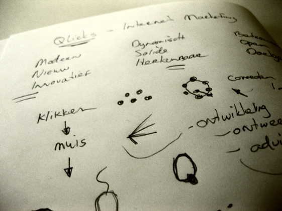
Once I have all the information I need, the brainstorming begins. While brainstorming I keep in mind what would set the company apart and what would make the logo unique. I sum up all the keywords from the briefing and write them down in my sketchbook.
Now the sketching can begin. Sketching should be done on paper, since sketching on your computer holds back your creativity. Start out with simple ideas and try some combining, rotating and merging. Don’t just use your two eyes, but try to look further into it. Use a third eye, one that sees things that any ‘normal’ person would not see.
Don’t worry about the way you sketch. There’s no such thing as a bad sketch. Go wild!
When you’re done sketching and get to a point where you have the perfect idea, you can switch over to your computer and start working from there. At this project I had the idea of ‘the finger on a mouse’ symbol to represent the name Qlicks. I opened up Illustrator and drew the mouse and the finger in an abstract way. This went on till I got the right width, line structure and shape for the symbol. Because the company name is Qlicks (plural) and not Qlick I tried several ways to multiply the symbol.
The final shape that both me and my client were happy with was ready.
Now it was time to add the name to the symbol. I needed a round type to fit the rounding lines in the symbol. The type I was happy with was Arial Rounded MT Bold. The only thing I didn’t like about the type was the letter ‘Q’ so I modified it to make it look similar with the other letters and the symbol.
The logo was now almost ready. All it needed was some coloring. The client and I agreed that it would be blue. Blue is the color of the sky and the sea, and is associated with depth and stability. It symbolizes confidence, trust, loyalty and truth. Exactly what the company stands for. The final logo has three shades of blue, overlapping each other. It represents the dynamic, transparant and openminded way of service the company gives to their clients.
And there it is. The final logo. More of this project can be found here and you can see the logo in action here.
unieq is a company specializing in brand identity design. We create designs that effectively represents the identity of each of our client companies to ensure that everyone can see what the companies do and what they stand for. We do this for each of our clients through detailed design of logo, letterhead, business cards, envelopes and other communication materials.
They will explain the process of designing the Qlicks logo
The process of designing a logo differs from designer to designer. I’ll explain here how I handle the logo designs for my clients. The logo I’ll be discussing here is the Qlicks logo. Qlicks in an Internet Marketing company, specializing in strategic marketing communication.
It all starts with a detailed briefing. Since not all clients know what information is important to myself, I hand them over my list of questions. The questions vary from regular info about the company to who their competitors are, who their target audience are, how they would like to be seen as a company etcetera.
Once I have all the information I need, the brainstorming begins. While brainstorming I keep in mind what would set the company apart and what would make the logo unique. I sum up all the keywords from the briefing and write them down in my sketchbook.
Now the sketching can begin. Sketching should be done on paper, since sketching on your computer holds back your creativity. Start out with simple ideas and try some combining, rotating and merging. Don’t just use your two eyes, but try to look further into it. Use a third eye, one that sees things that any ‘normal’ person would not see.
Don’t worry about the way you sketch. There’s no such thing as a bad sketch. Go wild!
When you’re done sketching and get to a point where you have the perfect idea, you can switch over to your computer and start working from there. At this project I had the idea of ‘the finger on a mouse’ symbol to represent the name Qlicks. I opened up Illustrator and drew the mouse and the finger in an abstract way. This went on till I got the right width, line structure and shape for the symbol. Because the company name is Qlicks (plural) and not Qlick I tried several ways to multiply the symbol.
The final shape that both me and my client were happy with was ready.
Now it was time to add the name to the symbol. I needed a round type to fit the rounding lines in the symbol. The type I was happy with was Arial Rounded MT Bold. The only thing I didn’t like about the type was the letter ‘Q’ so I modified it to make it look similar with the other letters and the symbol.
The logo was now almost ready. All it needed was some coloring. The client and I agreed that it would be blue. Blue is the color of the sky and the sea, and is associated with depth and stability. It symbolizes confidence, trust, loyalty and truth. Exactly what the company stands for. The final logo has three shades of blue, overlapping each other. It represents the dynamic, transparant and openminded way of service the company gives to their clients.
And there it is. The final logo. More of this project can be found here and you can see the logo in action here.
|
|
 Go to Homepage