26
Nov
Description:
Next Logo![]()
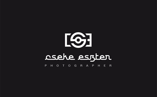
Before I designed the logo, I’ve had an interview with Eszter. It turned out, that she didn’t have a special idea what it should be, but she new what she wouldn’t like to see in her logo. From here it was simple way to a simplistic typo logo. The typographic logo imitated a camera from the initials of Eszter’s name. I’ve managed to solve the strongly geometric angular closeness of the main theme with a retro mood cursive font type. The cost-effective predictability was an aspect too, when I made the image. Each image element in one color version may be produced, where the color of your material is the other color. In the future it can be printed at home. The simple main motive which is the basic elements of design can be varied easily. The color of choice was not wide. We were discarded the only residual color, so we remained in photography accessories, such as black, white and gray.
Portfolio: http://www.behance.net/sandorlaszlo
Designer: László Sándor
|
|
 Go to Homepage