26
Nov
Description:
Next Logo![]()
1) Brandclay
The brandclay logo is an example of an elegantly distilled concept, complemented by a well thought out execution. While the hands imbue a sense of craft and personal connection to the brand, the earthy tone lends a feeling of grounded stability. Clean modern typography accompanies the mark, and results in a solid package through and through.
Designer Name: Sean Farrell
Designer’s portfolio: http://www.brandclay.com/
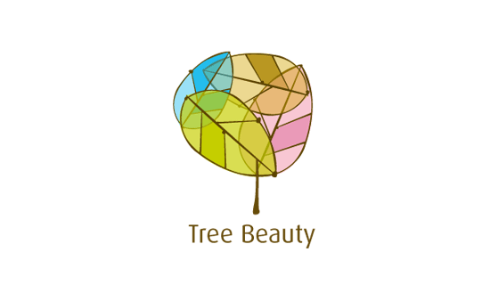
2) Tree Beauty
A beautiful example of balanced color and form. The idea of reducing the tree down it's parts and reconstructing it has resulted in unique and noteworthy mark, which in my opinion is particularly well suited for the brand.
Designer Name: Gary Chew
Designer’s portfolio: http://www.behance.net/garychew
3) Arnaut Vitor
A striking logotype with intriguing twists on the letterforms throughout. The reflection of the A & V on the last and first names play well together, and seem to echo a sense of balance seen in the photographers work that it represents.
Designer Name: Denis Ignatov
Designer’s portfolio: http://hyperian.ru
July 2010 Judge: Michael Spitz
Michael Spitz is an American designer, and founder of a self titled studio. He specializes in identity development, as well as illustration, custom typography, and information design.
Since graduating from Parsons in 2006, he has had the opportunity to work with numerous client from across the globe, ranging from independent startups, to fortune 500 companies. At present, he balances the majority of his time between the States and the Croatian coast, where he has been situated since 2007.
The brandclay logo is an example of an elegantly distilled concept, complemented by a well thought out execution. While the hands imbue a sense of craft and personal connection to the brand, the earthy tone lends a feeling of grounded stability. Clean modern typography accompanies the mark, and results in a solid package through and through.
Designer Name: Sean Farrell
Designer’s portfolio: http://www.brandclay.com/
2) Tree Beauty
A beautiful example of balanced color and form. The idea of reducing the tree down it's parts and reconstructing it has resulted in unique and noteworthy mark, which in my opinion is particularly well suited for the brand.
Designer Name: Gary Chew
Designer’s portfolio: http://www.behance.net/garychew
3) Arnaut Vitor
A striking logotype with intriguing twists on the letterforms throughout. The reflection of the A & V on the last and first names play well together, and seem to echo a sense of balance seen in the photographers work that it represents.
Designer Name: Denis Ignatov
Designer’s portfolio: http://hyperian.ru
July 2010 Judge: Michael Spitz
Michael Spitz is an American designer, and founder of a self titled studio. He specializes in identity development, as well as illustration, custom typography, and information design.
Since graduating from Parsons in 2006, he has had the opportunity to work with numerous client from across the globe, ranging from independent startups, to fortune 500 companies. At present, he balances the majority of his time between the States and the Croatian coast, where he has been situated since 2007.
|
|
 Go to Homepage